
Sky Sec Knowledge
Why Sky Uses a One-Screen Approach — Control, Speed and Confidence for Serious Practitioners
By Mark Silberman B.Acc CA(SA), SAICA Tax Technology Committee · 2 August 2026
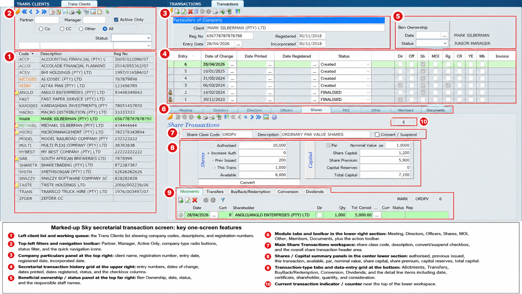
There has been a comment that some Sky screens are “too busy”. We understand the comment, but it is important to explain the thinking behind the design.
Sky was not built as a simple form-filling system for occasional users. It was built as a professional working platform for tax, secretarial and compliance practitioners who need to process large volumes of work accurately, quickly and under control. The one-screen approach is a deliberate design decision. It is not an accident.
Many software systems break a process into numerous pop-up windows, tabs, sub-screens and hidden menus. The user starts on one screen, opens another, then another, and soon loses track of where they are, what was changed, what still needs attention and where the supporting information sits. This may look visually lighter at first glance, but in practice it can make the system harder to control.
Sky takes a different approach.
One Screen, One Process, Full Control
The purpose of the one-screen approach is to keep the whole process in front of the user.
Where possible, Sky brings together the key information, status, supporting documents, SARS data, calculations, client information, notes and workflow controls into a single working area. This allows the practitioner to see the whole picture before taking action.
This is particularly important in tax and secretarial work. A practitioner does not merely capture data. The practitioner must review, compare, check, decide, submit, evidence and retain a permanent record of what was done. These are not isolated steps. They are part of one professional process.
A one-screen approach allows the user to work with context.
Designed for Power Users
Sky is designed for power users and professional firms that want to take proper control over their systems.
A power user does not want to click through ten windows to find one figure. A power user wants the important information visible, available and actionable. The screen must support judgment, speed and accuracy.
In a busy practice, users must be able to deal with hundreds or thousands of taxpayers, companies, trusts or transactions. They need to filter, review, compare, finalise, submit and follow up without losing their place. The one-screen approach supports this type of high-volume professional work.
It may look more comprehensive because it is more comprehensive.
Less Navigation, Less Confusion
A screen that shows less information is not always easier to use. Sometimes it simply hides the information somewhere else.
When information is hidden behind multiple menus or pop-ups, the user must remember where to find it. This creates unnecessary navigation. It also creates risk. The user may miss a note, overlook a status, forget to check a document, or submit before the full picture has been reviewed.
Sky reduces this risk by placing the relevant information close to the action.
The user does not have to ask:
- Where is the SARS status?
- Where is the assessment data?
- Where are the notes?
- Where are the documents?
- Where is the finalisation status?
- Where is the submission control?
The system is designed so that these items are available in the working process itself.
The Professional Desktop Concept
The Sky screen should be seen as a professional desktop.
An accountant’s physical desk is not empty when real work is being done. It contains the file, the working papers, the client instruction, the calculation, the SARS correspondence, the review notes and the checklist. The professional needs these items together to make a proper decision.
Sky recreates that working environment digitally.
The difference is that Sky organises the information, stores the evidence, controls the status, and allows the user to act from the same place. The objective is not to make the screen look empty. The objective is to make the work controlled, complete and efficient.
Better for Review and Evidence
Modern tax and secretarial work requires evidence.
It is no longer enough to say that something was done. Practitioners must be able to show what was done, when it was done, who dealt with it, what documents were relied on, what instruction was received and what final status was reached.
The one-screen approach supports this evidentiary requirement.
Sticky notes, document folders, transaction statuses, SARS records, finalisation controls and review points all work together. Anyone looking at the transaction can understand the history and the basis of the work performed.
This is far better than having important evidence scattered across emails, desktop folders, separate windows, WhatsApp messages or manual files.
Speed Comes from Familiarity
At first, a comprehensive screen may appear detailed. But once users understand the layout, the benefit becomes clear.
The user does not have to keep searching. The user learns where everything is. The same working logic repeats across the system. Over time, this creates speed.
This is the difference between a basic user interface and a professional production system. Sky is not designed merely to look simple on day one. It is designed to make the user faster and more accurate on day one hundred.
Avoiding the “Lost in the System” Problem
One of the biggest frustrations with many competing systems is that users get lost.
They open one window to capture information, another to review, another to submit, another to check the status, another to print, and another to attach documents. By the time the user returns to the original screen, the flow of work has been broken.
Sky’s one-screen approach avoids this problem.
The user remains in the process. The work remains visible. The next step is clear. The risk of losing context is reduced.
A System Built for Real Practices
Sky is built around the way real practices work.
- Real practices have deadlines.
- Real practices have staff turnover.
- Real practices have review responsibilities.
- Real practices have SARS follow-ups.
- Real practices have clients who query matters months later.
- Real practices need evidence.
- Real practices need control.
A clean-looking screen that hides the work may be attractive, but it does not necessarily help the practitioner manage risk. Sky’s design is based on control, not cosmetics.
The Right Balance
This does not mean that screens should never be improved. Any professional system must continue to refine layout, grouping, headings, workflow prompts and visual clarity. We will always listen to users and improve the experience.
But the answer is not to break professional processes into disconnected windows merely to make the first impression look lighter.
The answer is to keep the one-screen power of Sky, while continuing to improve the layout so that information is clearly grouped, logically arranged and easy to use.
Conclusion
The one-screen approach is one of Sky’s strengths.
It gives practitioners control. It keeps the full process visible. It reduces unnecessary navigation. It supports evidence. It improves review. It helps high-volume users work faster and with greater confidence.
Sky is designed for firms that want to take control of their tax, secretarial and compliance work — not be led blindly through disconnected screens.
A busy screen is not necessarily a bad screen. In a professional system, the right information must be available at the right time, in the right place.
That is the purpose of Sky’s one-screen approach.